Anami: a font with no name
This is a snapshot of a work in progress.
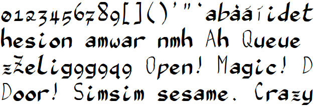
This is some text in one of the earliest versions of anami. I mostly drew
this one with FontForge's 50-unit-wide pen with a 5:1 width ratio
(stroke weight contrast) at a 45° angle (stress at 1:30 and 7:30), in a
500×1000 unit cell. One of the most conspicuous defects is that the "i"
and "l" occupy too little space in the fixed-width cell, so words that
contain them look too loose and spacey.
The upper case is kind of a "stand in" — it's not intended to be
good, just to make it possible to use the font enough to get some
experience with it. The upper-case C, for example, is just a stretched
version of the lower-case C.
After using that version for a while and tweaking it quite a bit, I
realized it needed a heavier line weight, both to be readable at all in small
sizes and to work well with other fonts on a web page. Here I've crudely
redrawn the lower case, but the upper case isn't done yet. This is mostly with
a 140-unit-wide pen with a 10:1 width ratio, although in some cases I
drew the characters a little larger and then scaled them down. Eventually I
switched to using a 120-unit-wide pen. (I also think the 10:1 ratio is
overdoing it for small point sizes.)
The same version in a smaller point size shows that it's still fairly clear
even when it's small, but it would benefit from a little less emphasis and a
little lighter line weight. Also, I suspect that the resolution characteristics
of an LCD screen make the ancient 45° tradition suboptimal: by making vertical
lines as heavy as horizontal ones, I'm throwing away the 3× resolution
advantage the LCD has in the horizontal dimension. It would be better to
put stress at 1:00 and 7:00.
The juxtaposition of the heavier lower case and the not-yet-redrawn
upper case and punctuation shows very clearly the problem with
readability in small point sizes that I was redrawing to fix.
After some work, I cleaned up some of the dirtier parts of that
version. You can see here that the slant is somewhat more consistent
here: "d" and "b" are not so vertical, and "i" is a little more so, for
example; and I also cleaned up the baseline alignment a bit, e.g. on
letters like the "m", which was reaching too far down. One of the
advantages of making the letters a little more oblique like this is that
it decreases the color-fringing side effect of subpixel antialiasing;
here's the word "don't" before and after, although in slightly different
font sizes; you can see that the red on the left and the blue on the
right of the stem of the "d" are only at the top in the second one.


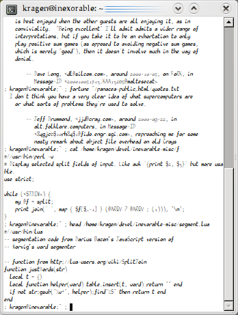
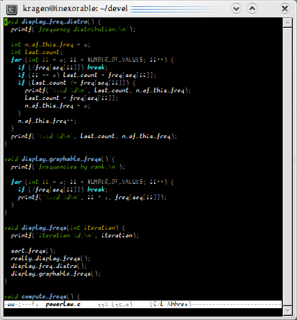
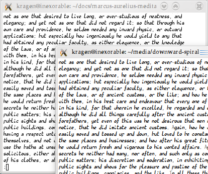
I also thought I should include some source code in here, since the
payback for giving up proportional fonts is that things that are
formatted in fixed-width characters — like ASCII art and program source
code — appear as they should. You can see that I still haven't redrawn
the punctuation characters with the heavier line-width.
This terminal window is 80×39 characters and 588×656 pixels, which
makes the font 7×16 in this point size, which I think is "10 point".
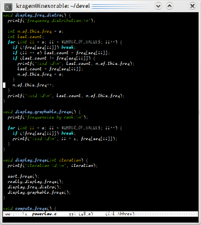
And here we see how it looks in a smaller point size again. This
window is 348×461 pixels, making the font 4×11 pixels, only 10% bigger than
the old VT-100-era 5×8 pixel fonts. I think that makes it "5 point". I'm
not sure why it ends up at 4×11 instead of, say, 4×8. Very few
glyphs extend out of the roughly 500×1000 box.

Here's xterm using the 5×8 font that ships with X11 under the name
“5x8”; this gives 40 pixels per character to the 44 in the anami window
above. It's not clear whether anami or 5x8 is less unreadable at this
size, but anami sure looks a lot better. But it's sort of cheating,
because anami is using LCD subpixel antialiasing, so it effectively has
3× as many the pixels to work with as the hand-drawn pixel font, plus
grayscale.

This is gnome-terminal using the system default monospace font, which
does use LCD subpixel antialiasing. Due, I assume, to GNOME's
Microsoft-derived tendency to name things with no indication of their
origin, I know this font only as "Monospace". This window is 418×419,
which makes this font 5×10. It looks a lot better than the
5x8 bitmap font above, and I think it may be more readable than anami at
this size, even just in the lower case. (I do think anami is
better-looking, though.) On the other hand, 5×10 is 9% more pixels than
4×11, so maybe that's not a fair comparison.

Here I've persuaded gnome-terminal to display it at 4x9. It seems to
be roughly as readable as at 4×11.
This shows why I think the 10:1 contrast on the pen is too much.
It's a little excessive in black-on-white, but not too bad; but in
white-on-black, it's nearly intolerable. Here, the capital letters drawn
with the 50-unit-wide pen are perfectly readable, despite being fairly
small, unlike in black-on-white; but the heavy lowercase with its heavy
contrast appears clumsy, sloppy, and hard to read.
This also illustrates that it's a bad idea to rely too heavily
on subpixel resolution, because colored text can take it back away
again.
Here's the same text after some more work, redrawing the digits and
some of the punctuation with a different pen. On the theory that subpixel
antialiasing gives me 3× better resolution in the horizontal than in the
vertical, I'm using a 60° angle for the pen now to try to take better
advantage of that; not sure yet if it's working. You can see the
difference between the three different families of characters here:
As a result of the change to the pen, the newly redrawn "0" has its
strongest stress at 1:00 and 7:00, while the not-yet-redrawn "o" still
has its stress at 1:30 and 7:30. I also changed the pen to use a 6:1
contrast instead of 10:1, because 10:1 left some strokes too thin in
small font sizes, and a maximum stroke width of 100 units, 0.1em,
because I thought the lowercase was a little too black overall.
The uppercase, some of the punctuation, and the dotless "i" used to
make "í" have not yet been redrawn from the much-too-light stroke width
from the first screenshot at the very top: 50 units.
There is a little bit of variation in stress angle in the lowercase,
because some of the letters were drawn originally with 45° stress, then
rotated into their current orientation. I'd like to have a little bit
more such variation, for purposes of manifesting better wabi-sabi, but I
don't know how to get it.
The pen angle shows up not only in the angle of stress in curved
strokes, but also in stroke terminals, which you can see are more nearly
vertical on the newly drawn glyphs like "[]" and "1" than on the
older 45° glyphs like "h" and "m".
You can see that the "q" has a serious problem, one shared to
a lesser extent by the "b". Monaco, Susan Kare's and Kris Holmes's
very popular script-inspired fixed-width typeface for the Macintosh,
shows how to solve this problem; but I haven't done it yet.
Here you can see a comparison of two types of antialiasing. If you're
viewing this at 1:1 zoom on a standard LCD screen with the subpixels in
the usual R-G-B order, the subpixel-aliased text on top will look a
little sharper and less gray, while the grayscale-antialiased text in
the window below will look a little less sharp. At this size (5×13), the
effect is fairly subtle. It matters a bit more at very small sizes like
the 4×9 size shown above.