Making the oilpencil font from scratch in 24 hours
Starting Friday, 2007-01-05, I spent about 24 hours making a
TrueType font from a handwriting sample from a previous
night — my first experience making a
TrueType font. Much to my surprise, the result was good enough to use
at smallish sizes. So I thought I'd write about the experience, in
case other people wanted to try something similar; related pages
include Tom 7's
fontmaking page and Ben Sittler's
announcement of some fonts of his own. 2008 update: pandaba recommends the MyFirstFont.com tutorial, which looks
pretty awesome, although it involves proprietary software.
I finished up on Saturday morning, and you can download the
resulting font at the oilpencil font page.
Apparently this same service — turning your handwriting into
a TrueType font — is available for US$9 from a fully-automated
web site called Fontifier, by
a company called "Human-Computer Interface", apparently by a person
named David Johnson-Davies.
Overview
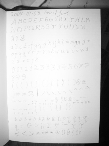
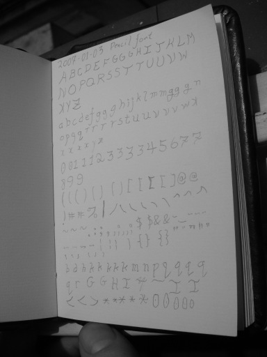
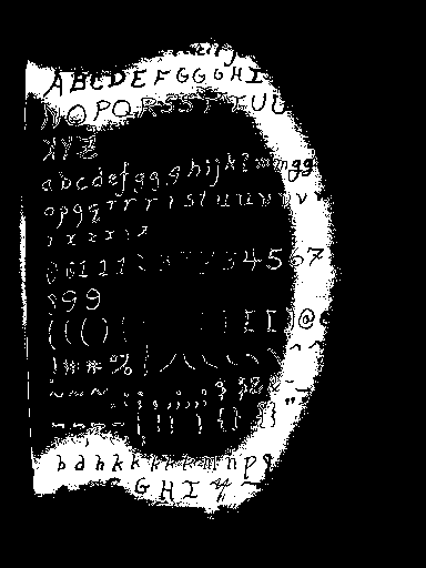
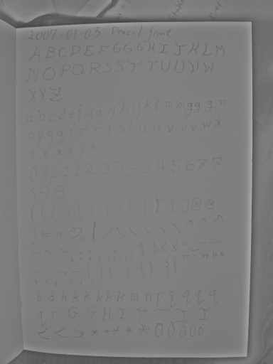
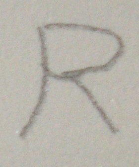
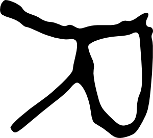
For the most part, I created the glyphs by the following process
(illustrated here with capital R):
-
 drew the
font originally with an 0.3mm mechanical pencil in a page of a
paper notebook
drew the
font originally with an 0.3mm mechanical pencil in a page of a
paper notebook
-
 photographed the whole page with a 5Mpix digital camera
-
 thresholded the results with the GIMP
-
 used the GIMP's "oilify" filter to clean up the result a bit
-
 converted it to vector outlines with potrace (svg)
-
 cleaned up
the results with Inkscape (svg, eps)
cleaned up
the results with Inkscape (svg, eps)
-
 imported
the results into Fontforge
imported
the results into Fontforge
This was a bad way to do things, because it took me a lot longer to
turn the page into good character outlines than it would have taken to
draw them from scratch in Inkscape or even Fontforge, which is what I
did for some of the later characters. However, the pencil is much
faster for experimenting with shapes and weights and so forth than
Inkscape, at least for me with my tiny low-quality optical mouse.
Tools
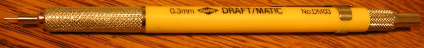
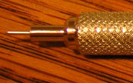
Alvin "DRAFT/MATIC No. DM03" 0.3mm mechanical pencil.
I like
this pencil a lot, but I think that's mostly because it's an 0.3mm
mechanical pencil. You used to be able to get 0.3mm pencils and lead
at office-supply stores that sold drafting supplies, but I had to go
to an art store to find it. It cost US$12, plus another $8 for the
lead. With it I can handwrite legible text in my paper notebook at
5-7 lines per inch, 3-4 words per horizontal inch, which is somewhere
around twice the information density of "standard" textual computer
printouts (66 lines of 80 columns per A4-size page). Sadly, though, a
nice pencil is not enough to compensate for my lack of artistic
expertise.
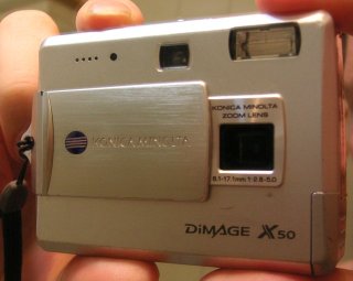
Konica Minolta DiMAGE X50 5-megapixel digital camera.
This
belongs to Beatrice. It's a lot more portable than a flatbed scanner,
and I used it to photograph the page at about 470 dpi. Unfortunately,
we don't have RAW-processing software for it, so we lose a bit of its
potential resolution for monochrome applications like this. This
model of camera currently (2007-01-07) costs about US$110 on eBay.
(Auctions to check after they close for pricing: 1
2
3
4
5
6)

The GIMP,
version 2.2.8. Current is 2.2.13. An image editing program similar
to Adobe Photoshop.
potrace, version
1.5.
Current is 1.7. Turns pixel graphics into outlines.

Inkscape, version
0.40.
Current is 0.44.1. A vector graphics editor, similar to
Adobe Illustrator, that uses SVG as its native file format. I find
editing shapes in Inkscape noticeably easier than editing them in
Fontforge.

Fontforge,
version 20041218.
Current is 20061220. An outline font editor
similar to Fontographer. I haven't used any other font editors in the
past, but man, Fontforge is awesome! It looks like the other programs
that do similar things are Fontographer, Fontlab, Metafont,
Ikarus/FontMaster, and TypeTool, more or less in order of
popularity.
An optical mouse.
My laptop has a "nipple mouse" rather than
a real mouse, and it's very difficult to control. I've finally gotten
used to it, but it's very slow, especially for freehand-drawing kinds
of things. A tiny no-brand USB optical mouse helps a lot here.
Comments on the steps
Here's some of the stuff I learned doing things this way.
I spent most of my time interfacing one thing to another, not
drawing letters. This was partly because I was learning things,
partly because some things were buggy, partly because I couldn't
figure out how to script them. Mostly, I think it was because I
didn't know there was a better way.
Drawing
I find drawing with a pencil a lot easier than drawing on a
computer, even with the optical mouse. But eventually, I found
drawing in Inkscape easier than going through the whole paper path.
Still, drawing in Inkscape went better with some sketches on paper
first.
Digitizing
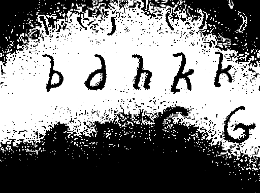
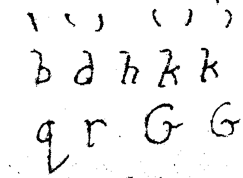
I photographed the page at about 450-500 dpi, and a typical source
letter was 80x80 pixels, with typical letter features being 5 or 10
pixels across. This ought to be enough resolution for the task, and
actually I should have been able to get away with considerably less;
however, Tom 7 recommends 300xN pixels per scanned letter, and that
probably would have worked better. In fact, though, the image quality
gave me problems from beginning to end — but not because of
resolution. A reduced-size version of the image, with one pixel for
every 5x5 pixels in the original image, is shown below.
For one thing, the picture was slightly blurry, possibly out of
focus, although I didn't notice this until too late. The biggest
problems were lighting variation and noise.
I probably should have used sunlight or intense off-camera light,
but I didn't. And the camera was fairly close to the page, so the
difference in distance-to-flash between different parts of the page
was fairly substantial, and the whole page was toward the top of the
camera's dynamic range. The whites in the middle of the page were 254
(on a scale of 0 to 255), while whites toward the edge of the page
were only around 180. The difference between "white" and "pencil
lead" was only around 30 counts at best, and in many places was only 5
or 10 counts. So the spurious variation in brightness across the page
was 2-25 times larger than the variation representing the pencil
marks.
The flash illumination also caused some trouble by causing specular
reflections off the pencil lead in places, putting bright white in the
middle of some of the letters.
There were also (at least) two sources of noise — camera
sensor noise and the surface texture of the paper, which resulted in
brightness variations under the oblique point-source lighting
conditions of the on-camera flash. I don't know how to separate the
two, but different parts of the page had the following ranges of
apparently random local variation: 177-187, 189-197, 199-208, 218-225,
229-232, 233-238, 244-247, 253-254.
In general, light helps with noise and blurring, by turning down
the gain on the sensor, using a smaller aperture, and using a shorter
exposure time.
Shorter exposure times reduce blurring because things don't have as
much time to move or vibrate; smaller apertures reduce blurring
because they increase the depth of field, reducing the necessity of
correct focus; and lower gain (expressed in terms of ISO) reduces
noise originating at the sensor.
According to the EXIF information, my original photo used ISO
equivalent of 160, exposure time of 5.6ms, and an aperture of f/6.7; a
new photo of the page that I took today with the same camera, without
the flash, of the same page, in cloud-attenuated sunlight used ISO
equivalent of 50, exposure time of 2.0ms, and an aperture of f/2.8.
(I'm assuming these numbers are correct.) f/2.8 (which means the
aperture diameter is the focal length, f, divided by 2.8) represents a
larger aperture than f/6.7, with a diameter 2.4 times as great,
and thus with 5.7 times the area — but with a PSF (point spread
function) dilated by 2.4 times larger. The other two changes
represent about a 9x increase in the amount of incident light required
to reach a given pixel value; the larger aperture cuts it down to
about 1.6x.
So when I retook this photo in diffuse sunlight instead of with the
flash, the lighting field was much flatter, any sensor noise was
reduced by more than a factor of 3, movement of the book or my hand
probably would have caused less than half as much blur (I'm assuming
that the exposure time wasn't significantly longer than the on time of
the strobe), and any being out of focus would have caused more than
twice as much blur.
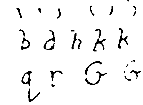
The upshot is that in this version of the photo, the lighter parts
of the page vary from the darker ones only by about 40 counts, the
random noise on the white paper is much less, and nearly all the
pencil marks are darker than nearly all of the paper. Compare the
original flash shot 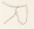 with the
sunlit version:
with the
sunlit version: 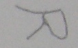
Thresholding
Thresholding is the process of taking a picture with lots of colors
in it (shades of gray, in this case) and turning it into a picture
with just black pixels, representing ink, and white pixels,
representing paper — no gray pixels.
This is where things started to get hard.
In this version of the reduced-size image, pixels with a brightness
between 230 and 240 have been turned white. There's a big white band
running around the page in areas where the paper was mostly between
230 and 240, although it's dotted with specks where there was random
local variation outside that range. Even with this severe reduction
in size, many specks remain, showing how strong the random noise is.
Some of the pencil marks in this area are only 15 counts darker than
the white paper in their area, although others are as much as 30
counts darker. So it takes some work to find a threshold, even for a
single letter, that includes the pencil marks of that letter, but not
any of the white paper in the vicinity.
Perhaps more important for the quality of the final product, notice
how the black pencil shapes in the white band vary in thickness. They
were all drawn with the same pencil lead, and they're all pretty much
the same thickness in reality --- about 0.3mm, although there are
parts of some letters that are thinner. The aspect ratio of the
crossbar of the capital A is about 6:1. But in this thresholded
picture, it looks like it's about 2.5:1. Consistently, the letter
parts toward the outside (dimmer) part of the white band appear wider,
and the ones toward the inside (brighter) parts appear brighter.
Why?
Apparently, because they were blurry in the original photo. If
they had been clear in the original photo, there would be a
one-pixel-wide line of partly-penciled-in pixels separating a pool of
pure pencil pixels from a pool of pure paper pixels. But instead
there's a gradual slope from one to the other. If you run an
edge-detection algorithm like Sobel's on a blurry image like that, it
doesn't detect hard edges anywhere, but it detects soft but very wide
"edges" occupying the entire volume of the letter, with perhaps a
single-pixel-wide line of non-edge in the middle.
So if you threshold some part of this image with a fixed threshold,
not only will you get noise, but also, the width of the lines will
depend on what the threshold is. So some letters will look much
"heavier" than others. This effect is noticeable in the resulting
font, since I haven't taken the time to finish cleaning up the
mess.
So, in the GIMP, I decided to flatten out the lighting field as
well as I could before thresholding. I duplicated the layer (Layer
-> Duplicate), did a Gaussian blur (Filters -> Blur ->
Gaussian Blur...) with a fairly large radius, like 128-256 pixels.
The idea was to make a layer with the "paper color" of the area near
each pixel, approximately representing the lighting field. Then, to
find the difference between each "paper color pixel" and the actual
image pixel, I opened the Layers dialog (Dialogs -> Layers) and set
the opacity of the new layer to 50% and the "Mode" to "Subtract".
This resulted in a much "flatter" image, with a more even paper
brightness over the entire image, which made it possible to set more
sensible thresholds. It's not perfectly flat — paper that's
close to lots of pencil markings, or close to the edge of the paper,
gets a brightness boost — but it's a big improvement.
Unfortunately, it also lost one bit of precision from the original
pixel values, which is important when some of the pencil pixels only
differ from the paper around them by 5 or 10 counts. (I think it may
have lost more, but I can't prove it.) And it has some funky behavior
with the edge of the image — maybe it's treating it as black?
I'm not sure.
Here you can see the results; while without flattening, no single
threshold was even close to adequate for even two successive lines of
text, after flattening, results are much more consistent. But another
problem remains.
Because of the combination of thick, blurry letter-edges, and
random noise that's almost as bright as the pencil "signal", any
threshold picks up all kinds of random shapes attached to the edges of
letters, even if it avoids picking out speckles all over the
paper.
At first, I was so stupid that I set my thresholds with the
"Curves" dialog box, by drawing a curve that was 0 until it hit the
threshold, then jumped right up to 1. This was painful and
time-consuming, partly because there's some kind of built-in limit on
how fast the curve can rise, so sometimes I had to go through multiple
iterations. After about 20 minutes of this, I noticed that Tools
-> Color Tools also had a "Threshold..." option. That made
thresholding a lot easier! Be less stupid than me. I'm still too
stupid to find the GIMP option that does the same thing as 'pgmnorm',
though &mdash turning the brightest color into white, the darkest
color into black, and linearly stretching everything in between. I
can manually do it with the "Levels" dialog box.
In general, this strategy of thresholding each pixel by its
difference from other pixels nearby instead of by its raw value is
called "adaptive thresholding", and I probably should have used some
existing adaptive-thresholding code; but I thought doing it by hand
would be faster in this case.
Around this time, I started working with small parts of the image
instead of the whole thing. It wasn't just that setting a single
threshold for the whole image was impossible (even after flattening);
it was also that the GIMP was using lots of memory and all the
operations were kind of slow, and once I started importing paths into
Inkscape (see below), it got way slower.
I also learned that the "Threshold..." dialog can apply to just the
current selection; this allowed me to set slightly different
thresholds for each letter, which helped a fair bit with the later
letters.
Oilifying
As mentioned previously, due to the blurry letter edges, lots of
noise sticks to the sides of letters. I haven't found a way to get
potrace (see below) to ignore chunks of noise smaller than a certain
size when they're stuck on the sides of bigger shapes like this. It
has a "-t" option (short for "turdsize") for ignoring stray pixels off
by themselves, but setting that to 10 or so didn't have any visible
effect on letter outlines.
xv (wow, I sure do miss xv, but I stopped using shareware a while
back) had a filter called "oilpaint", which replaced each pixel with
the most common pixel in its neighborhood. It occurred to me that
something similar, used on the output of thresholding, would clean up
some of that poop stuck to the sides of letters.
It turns out that the GIMP does have something called "Oilify"
(Filters -> Artistic -> Oilify), and
while what it does is not documented, it seems to do more or less the
right thing.
Converting to Vector Paths
I used stand-alone potrace to vectorize the paths. I used this tiny Makefile to invoke it:
%.pnm: %.png
	pngtopnm < $< > $@
%.svg: %.pnm
	potrace --svg < $< > $@
There's not much more to say about potrace, except that this was a
dumb idea and I should have used one of the integrated potrace
interfaces in Inkscape and Fontforge (see Better
Ways to Do It).
Cleaning Up the Paths
Most of the time that I spent on this project was time I spent
shuttling data from one program to the next. Most of the rest was
time I spent cleaning up paths.
Basically, once you load an SVG file into Inkscape, you can edit
the "paths" in it. Each letter is outlined by "paths" — one
that goes around the outside, and maybe more that make holes in the
middle. Each path is made of "nodes" connected by curves and lines.
The "F2" key lets you click on a letter and see all the nodes.
Pretty much anything in Inkscape can be undone with Ctrl-Z and
redone with Ctrl-Y. I use Ctrl-Z several times a minute on average in
Inkscape.
If you potrace several letters at once, initially all the paths
will be combined into one single path object. There's an option on
the "Path" menu to "Break Apart" this object into its component paths,
which you can then manipulate individually — for example,
selecting some of them, deleting them, cutting and pasting them into a
new document, or just moving them outside of the area where they
started. You'll have to use the "Path ->Combine" option to put
them back together in order for holes in the middle of letters to work
right.
The letters out of potrace will generally have a lot of ugly knobs
and things on them. The "Path -> Simplify" option can help a lot
with this by removing extra nodes, and you can remove more of them
yourself by clicking on the node and hitting the "Delete" key.
You may have to adjust the control points attached to the remaining
path nodes to get the shape of the curve back, but usually you can get
by with only one control node on each side of each 90-degree turn in a
curve (so two for a right-angle bend, three for a half-circle, four
for a circle), plus a node at each corner. As produced by potrace,
Inkscape thinks of the nodes as "cusp" nodes, which can have sharp
angles at them, but none of them actually will have sharp angles. If
you're moving the control points attached to one of these nodes, you
will often want to hold down the Shift key to move both control points
in sync, to avoid introducing a sharp point.
The distance between the control point and the node controls the
"stiffness" of the curve on that side of that node. Nodes whose
control points are very close to them are only introducing small local
jogs in the curve. Usually I delete them. If you delete a lot of
nodes from a curve, you'll probably want to stiffen the curve at the
remaining control points so that it remains curved.
If a node has very different stiffnesses on its two sides, the
abrupt change in curvature will be conspicuous and possibly ugly. If
you want to avoid this automatically, you can Ctrl-click on the node
until it says it's become a "symmetric" node in the statusbar at
bottom. A "smooth" node is constrained to have its two control points
be in line with each other, so there's no sharp angle, but abrupt
changes of curvature are allowed.
A smooth control point (or a cusp that's currently configured like
one) will be an inflection point in the curve if its control points
are on opposite sides of the curve. If that's not what you want,
adjust them until they're on the same side of the curve. You may want
to zoom in ("+" key) for this.
For a curve segment that's relatively evenly curved — neither
flat in the middle nor flat toward the ends — the control points
should be about as far apart as they are from their nodes, so they're
near the one-third and two-thirds points along the curve.
Fewer control points are generally better than more. In the rare
cases where you do need to add a control point to a potrace-output
curve, click on the node at one end of the segment, shift-click on the
other, then click the "insert new node" button. The new node starts
out as a "smooth" node, so you may have to Ctrl-click it into
submission. Also beware — all three nodes stay selected, which
is handy if you want to add more nodes (just click the button again)
but annoying in the normal case where you just want to move your newly
created node.
Because all of this curve editing was so painfully slow, I imported
a lot of the lowercase letters and digits without cleaning them up at
all. Much to my surprise, at the sizes I usually have them on my
screen, I can barely see all the pixel poop on, say, "h", or "j", "q",
or "9", or especially "w", "1", "2", and "8".
Tom 7 knows roughly a thousand times as much as I do about making
fonts, and his page on making
fonts with Fontographer explains many more fine points. Most of
the details are applicable to Fontforge as well, down to things like
Ctrl-K to open the metrics window.
Importing Into Fontforge
Once I had things looking OK in Inkscape, I would do Ctrl-C to
copy, Ctrl-N to open a new drawing, Ctrl-V to paste, possibly resize
the results (I think the size and position of the letterform in the
drawing controls the initial size and position of the letterform in
the character cell in Fontforge, but I'm not sure), then Ctrl-S to
save the result as EPS &mdash I have to select the "EPS" format from
the menu near the bottom of the "Save as" dialog box. (It isn't
sufficient to type "uni0041.eps" in the filename box; that will result
in an SVG file named "uni0041.eps.svg" if it's set to save as SVG.)
Then there's some annoying "EPS save options" dialog box that comes
up. My version of Inkscape has a couple of bugs — it can't
reimport the EPS it exports, and if you close the window that saved
the first EPS, later EPS saves fail silently (although they do print
error messages in your xterm if you launched Inkscape from an
xterm.)
For some reason, much of the time, the letter would paste into the
new document sideways and backwards by default. There are toolbar
buttons conveniently placed to fix this.
Closing a drawing that has been saved only as an EPS requires
dealing with an annoying confirmation dialog box; if you pay enough
attention to it, you might notice that the error message is different
than usual if an EPS save silently failed.
(I really wish there was a "save selection as EPS file" command.
Maybe there is and I'm just too dumb to find it. There is an online
tutorial for creating
extensions to Inkscape in Python so it should be easy to add.)
All of this makes exporting letterforms from Inkscape into EPS
time-consuming and maddening. Fortunately, importing them into
Fontforge is marginally less time-consuming and maddening.
"Import" is on the "File" menu in Fontforge, and the dialog box
that comes up has a list of file formats available, one of which is
"EPS". You can select a filename by typing the beginning of it, but
only if you type fast.
It's probably better to use the "EPS Template" feature of Fontforge
(see below). But, either way, once you have
the letterforms loaded into Fontforge, you have to move and resize
them into position, and possibly also rotate them. For no reason I
could figure out, about a third of my letterforms got loaded in
rotated about 135 degrees counterclockwise.
Moving and resizing the outlines in Fontforge, once you've imported
them, is fairly straightforward, if boring. There's a "resize" tool
in the Fontforge toolbox; you drag from the fixed-point of the resize
in a direction that indicates what kind of resizing you want to do.
Normal resizing is up and right for larger, or down and left for
smaller, and holding down "shift" constrains it to screw up the aspect
ratio only by integer ratios. If some nodes are selected (highlighted
in yellow), only they are affected; otherwise all the nodes and also
the character width are affected, and sometimes the character width
ends up someplace far away.
I started out manually kerning character pairs, but eventually I
gave up and kerned by classes instead. Since none of my software pays
any attention to the kerns, this was wasted effort for me, and I don't
know how bad or good a job I did.
Version Control with darcs
It turns out that the Fontforge .sfd file is a text file that can
be sensibly version-controlled --- changes tend to be limited to a few
lines at a time. After the first time or two that Fontforge crashed
on me, I decided to keep this project in a source-control system so I
could go back to older versions if Fontforge wrote something to the
file that caused it to crash at startup.
This was as simple as
darcs init
darcs add oilpencil.sfd
darcs record
and then periodically doing darcs diff -u and darcs
record.
I considered checking all the original source photos and parts of
them into the project, but they are much too large. I have, however,
included the whole web site in the darcs repository in order to make
it easier to manage, and this did save me from scrozzling a file
once.
Better Ways to Do It
I did this all in much more difficult ways than I needed to. Be
less dumb — here's several ways to make things easier next
time.
Potrace integration
If your input image isn't as screwed up as mine, Inkscape is
capable of doing thresholding and running potrace itself; there's a tutorial
on tracing with Inkscape on the project web site, and the same
tutorial is also included in the Inkscape package itself, on the
"Tutorials" submenu of the "Help" menu.
Fontforge
is also capable of running potrace itself ("Import" on the "File"
menu to read in the graphic, then "Auto Trace" on the "Element" menu;
it'll use either potrace or the "autotrace" program, whichever one is
installed) if you have already thresholded it, but doing it in
Inkscape has a couple of advantages. Fontforge can't import color
images in a useful way (even color images that contain only colors
that look pretty gray), so you have to convert the image to gray
before trying to load it into Fontforge; and unsurprisingly it doesn't
support JPEG. Also, Fontforge doesn't seem to be very smart about
thresholding them; Inkscape has a handy dialog box for playing with
the thresholding so you can get it right.
Template Imports
However, Fontforge does have the ability to import and autotrace a
whole bunch of characters at once, which might matter more. And if
you have a JPEG file of a letter that you want to turn into a
two-color JPEG, you can do it with these two commands (assuming, of
course, that you have netpbm and ImageMagick installed):
jpegtopnm < capital-r/photographed.jpg | ppmtopgm | pgmnorm > tmp.pgm
convert -monochrome tmp.pgm tmp.png
If I were again importing a bunch of outlines created in Inkscape
and saved in EPS into Fontforge, I would use the "EPS Template"
feature of Fontforge's file import. This feature allows you to import
a bunch of EPS files named uni0041.eps, uni0042.eps, and so on, as
Unicode characters U+0041, U+0042, etc.
Better Photography
If, for whatever reason, I import characters from physical objects
such as notebooks in the future, I will use a better scan. An actual
scanner would be great, but even with a camera, I could have done a
lot better:
- Use more light. Like daylight.
- Use a better camera, with a bigger lens and more pixels.
- Use flatter light — even with a flash, I would have been
better off shooting from further off, with a tripod, and using the
zoom.
- Shoot at higher resolution. 80x80 pixels per character (plus
some margins between them) is not enough, especially if the lines
are fine. 150x150 (plus margins, so 200x200) would probably be OK,
even though Tom 7 recommends 300x300 per character cell (including
margins). There were 201 glyphs on the page I was using, plus the
title line, so I would have needed at least four shots to get all
of them at 300x300, but at 200x200 I would have only needed two
shots.
- Use RAW processing. The default color mixing algorithms cameras
use cuts the potential monochrome resolution of the sensor in half,
and JPEG processing is pretty harsh on sharp lines. Unfortunately,
I don't think this camera even has a RAW processing option.
Grid Imports
It would be straightforward to write a script to extract blocks of
pixels from predetermined places in an image, saving each one to a
specially named file, so that they could all be potraced and imported
into Fontforge at once, without any further human interaction. With
specially-marked paper, such as standard blue-lined graph paper, it
might even be straightforward to undo perspective distortion from the
photo-taking process.
Drawing Stuff In Inkscape
Sketching stuff out on paper to see how it looks, fine. But for
the final letterforms, it's probably quicker to use Inkscape to draw
the thing than to use Inkscape to clean up the results of scanning. A
lot of the punctuation in oilpencil was drawn this way, because it
would have been just too much trouble to clean up all the pixel
poop.
For line drawings, Inkscape has this awesome feature called
"outset", which lets you take a path and make a bigger path around it,
just by hitting Ctrl-). So you can draw a "stroke" with the
stroke-drawing tool, adjust it to the right shape, convert it to a
path (on the Path menu, I think it's Stroke to Path) and "outset" it a
few times.
Scripting
Inkscape is apparently somewhat scriptable now. Fontforge is
definitely scriptable. Adaptive thresholding is definitely scriptable
(unless you have a totally hopeless image like I did). This could
have eased the workflow considerably.
Do the Font Metrics Right
I ended up with about the top 30% of the character cell completely
unused. This leads to a variety of problems in practice: characters
substituted from other fonts (accented letters, smart quotes, em
dashes) look out of place, multifont text looks awful, I have to set
my browser's default font size to 20 points to get readable text
(which makes text in other fonts huge by default), bullets in bulleted
lists are ginormous, and liquid web page layouts end up with far too
much space. And all the extra leading (line spacing) makes it hard to
get stuff on the screen.
Kragen Sitaker
<kragen@canonical.org>
 drew the
font originally with an 0.3mm mechanical pencil in a page of a
paper notebook
drew the
font originally with an 0.3mm mechanical pencil in a page of a
paper notebook 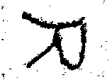 thresholded the results with the GIMP
 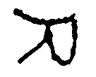 used the GIMP's "oilify" filter to clean up the result a bit
 converted it to vector outlines with potrace (svg)
 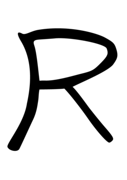 cleaned up
the results with Inkscape (svg, eps)
cleaned up
the results with Inkscape (svg, eps)  imported
the results into Fontforge
imported
the results into Fontforge 